Client:
LED Designs
LEDprofessor.com
Location:
Greensboro, NC
Project Overview:
In the early 2000s, as LED lighting technology was poised to revolutionize the industry, Jason Sloan founded LED Designs to provide both expert-level B2B solutions and consumer-friendly products. This project encompassed a full brand identity, including logo design, the development of two distinct websites, signage, print materials, and ongoing marketing support. The core challenge was to create a visual identity that communicated technical expertise, the beauty of LED illumination, and the company’s pioneering role in a nascent market – while also addressing the educational needs of consumers new to this transformative technology.
Challenge:
The project presented a unique, multifaceted challenge:
- Dual Audience: The brand needed to resonate with both technically savvy professionals (familiar with LED schematics, specifications, and complex installations) and a broader consumer audience seeking aesthetically pleasing, easy-to-use, and energy-efficient lighting solutions.
- Unified Identity, Separate Brands: The solution required visually unifying two distinct brands – LED Designs (focused on B2B sales, custom projects, and installations) and LEDprofessor.com (catering to consumers with ready-to-use products and educational resources) – under a single, cohesive logo and design language.
- Education and Innovation: In a market where LED technology was still relatively new, the brand needed to not only sell products but also educate consumers about the benefits, proper usage, and potential pitfalls (e.g., incorrect wiring, incompatible power supplies) of LED lighting.
- Capturing the essence of Light The logo should capture the benefit of light.
Solution:
The solution was a multi-pronged approach, centered around a powerful and conceptually rich logo that served as the cornerstone of the entire brand identity.

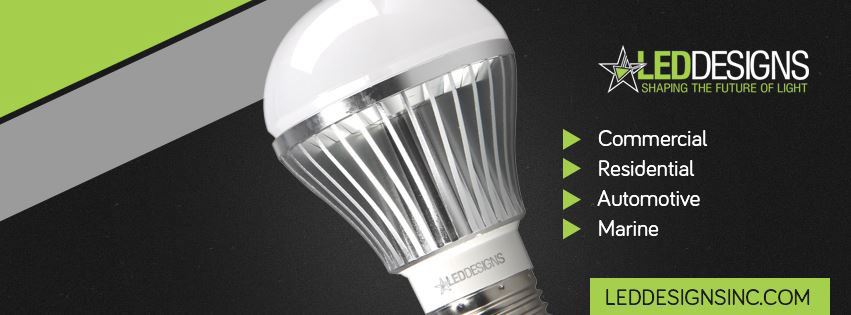
- The Logo: A Star is Born (with Technical Roots): The LED Designs logo cleverly combines two potent symbols: a stylized star and the schematic representation of an LED diode. The star, a universally recognized symbol of light, brilliance, and guidance, immediately captures attention and communicates the core benefit of LED technology – illumination. At the heart of the star, subtly embedded, lies the diode symbol. This direct reference to the technical foundation of LEDs speaks directly to industry professionals, instantly conveying the company’s deep understanding of the underlying technology. The design ingeniously uses negative space within the diode triangle to form the points of the star. This visually unites the technical and aesthetic aspects of the brand, creating a logo that is both conceptually meaningful and visually striking. The clean, sans-serif typography complements the geometric nature of the logo, with “LED” in all caps reinforcing the technical focus, while the lowercase “designs” adds a touch of approachability. [Insert high-quality image of the logo on a black background here. Include a close-up version highlighting the diode symbol within the star.]
- One Logo, Two Brands: A Unified Approach: While LED Designs focused on B2B sales and complex custom installations, LEDprofessor.com catered to the consumer market, providing easy-to-understand information and readily available products. The core logo – the star and diode symbol – served as a crucial visual bridge between these two brands, ensuring a consistent overall identity. Subtle variations were implemented to differentiate the brands. While the core logo remained consistent, the accompanying text (“LED Designs” or “LEDprofessor.com”) and its styling (e.g., font weight, color) provided clear distinction. This allowed for targeted messaging and visual cues for each audience, while maintaining a unified brand family. [Insert images showing the logo variations for LED Designs and LEDprofessor.com side-by-side, if possible.]
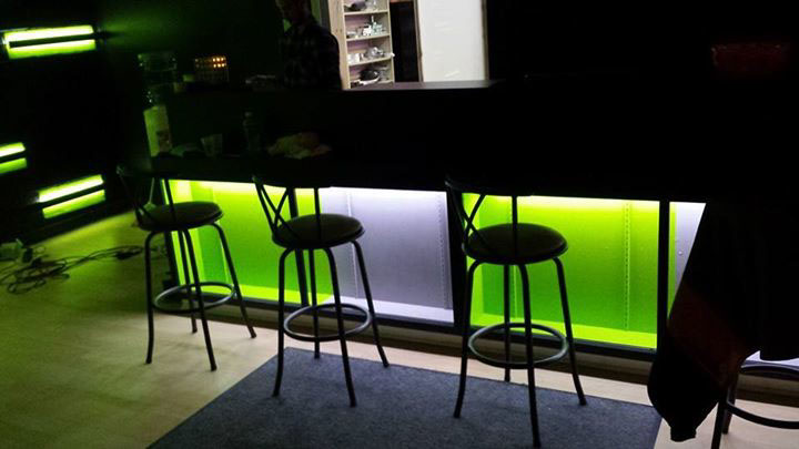
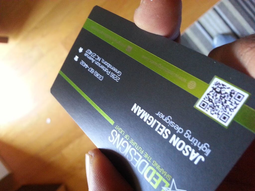
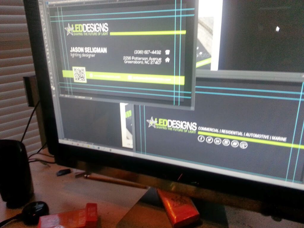
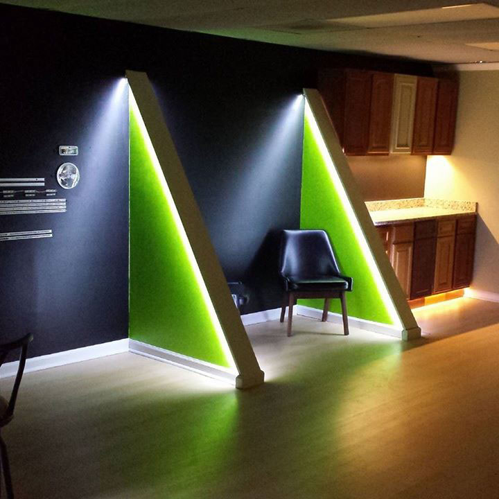
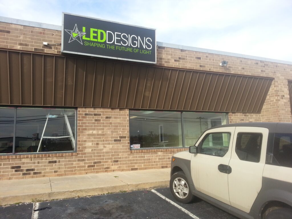
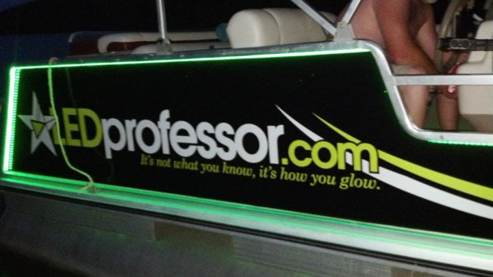
- The “Blackout” Aesthetic: Emphasizing the Light: To further emphasize the brilliance and visual impact of LED lighting, a strategic decision was made to utilize a predominantly black background across all brand materials. This “blackout” approach provides maximum contrast, allowing the light – both represented by the logo and emitted by the actual LED products – to become the central focal point. This choice also lent a sophisticated, premium, and modern feel to the brand. [Insert examples of the logo on black, and photos of the signage or other materials that use this aesthetic.]
- Educating the Market: The LED Professor: Recognizing the significant knowledge gap surrounding LED technology in its early days, we developed the “LED Professor,” a friendly, animated cartoon mascot. This character served as an educational guide, simplifying complex concepts, providing practical installation tips, explaining product features, and proactively addressing common consumer concerns and potential errors. The LED Professor appeared prominently on the LEDprofessor.com website, in marketing materials, and in product tutorials, fostering trust and positioning the brand as a reliable source of information. [Insert an image of the LED Professor mascot here.]
- Websites, Signage, and Print: A Cohesive Brand Experience: Two distinct websites were developed to cater to the specific needs of each target audience:
- LEDDesigns.com: Showcased the company’s B2B capabilities, highlighting custom projects, complex installations, and technical expertise.LEDprofessor.com: A WooCommerce-powered e-commerce platform offering consumer-friendly LED products, comprehensive educational resources (featuring the LED Professor), and a streamlined online shopping experience. This site included features like automated shipping label and packing slip generation for efficient order fulfillment.Both websites shared the core logo and visual identity elements (the star, the black background, the clean typography), but tailored their content, messaging, and user experience to their respective audiences. The branding extended to physical signage for the LED Designs retail showroom in Greensboro, NC, utilizing the signature “blackout” aesthetic to create a striking and memorable storefront. A range of print materials, including postcards, brochures, and print advertisements, were also produced, maintaining a consistent brand identity across all customer touchpoints.




Collaboration and Results:
The collaborative design process with Jason Sloan, including in-depth discussions about LED technology, schematics, and the target audiences, was instrumental in creating a powerful and meaningful brand identity. The resulting logo – the star with its embedded diode symbol – successfully communicated both the technical expertise and the visual appeal of LED lighting. The dual-brand strategy effectively addressed the needs of both professional and consumer markets, while the educational component, spearheaded by the LED Professor, played a vital role in building trust and driving adoption of this then-new technology. The cohesive branding across all platforms – websites, signage, and print – established LED Designs and LEDprofessor.com as leaders in the burgeoning LED lighting industry.
