
Client: Cap’s Urbanwear
Raleigh, NC & Greensboro, NC
Project Overview:
This project encompassed a complete brand overhaul for Cap’s, a clothing retailer, transforming it from a traditional “Clothier” to a forward-thinking “Urbanwear” destination. The project involved two distinct logo designs (the second significantly improving upon the first), a strategic name change, and the implementation of the new branding across a comprehensive range of marketing materials, including storefront signage (for multiple locations), a striking vehicle wrap, printed collateral, and large-format advertising. The project highlights the power of iterative design and the importance of adapting a brand’s identity to evolving market trends.
Challenge:
The initial challenge was to modernize the image of Cap’s Clothiers, a clothing retailer, to better appeal to a younger, more fashion-conscious demographic. The existing brand felt dated and didn’t accurately reflect the evolving style of the clothing being offered. A year after the initial rebranding, a second challenge emerged: to further refine the brand identity and solidify Cap’s position as a leader in the emerging “urbanwear” market. This required a more impactful and memorable logo, and a consistent brand presence across all customer touchpoints.
Solution:
The solution was a two-phase rebranding process, demonstrating a commitment to continuous improvement and adaptation.
Understanding the Brand: A Personal Journey
To be honest, I initially struggled to connect with the Cap’s brand. The high-end streetwear aesthetic, with its focus on designer labels and premium pricing, was outside my usual comfort zone. I didn’t immediately see the value in, for example, $65 jeans. However, I knew that to create a successful brand identity, I needed to understand the customer, not just the clothes. I dove into researching hip-hop culture, the core audience for this style of clothing. I explored the music, the fashion trends, and the values associated with this community. I even went so far as to purchase a pair of those $65 jeans with velvet-lined pockets! This immersive process was crucial. It allowed me to move beyond my initial skepticism and appreciate the craftsmanship, the status symbolism, and the self-expression inherent in high-end streetwear. This understanding became the foundation for the rebranding strategy.
Phase 1: Initial Rebranding (and Lessons Learned)
The initial rebranding effort involved designing a new logo and updating some basic marketing materials. While this was a step in the right direction, it became clear after a year that a more comprehensive and impactful change was needed.
Phase 2: The “Urbanwear” Transformation
The second phase involved a more strategic approach, including:
- Name Change: A pivotal decision was made to change the company name from “Cap’s Clothiers” to “Cap’s Urbanwear.” This change reflected a shift in the store’s product focus and positioned the brand at the forefront of an emerging fashion trend, even before “urbanwear” became a widely used term.
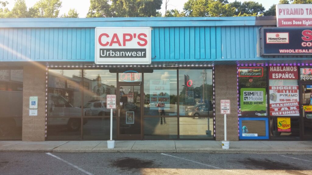
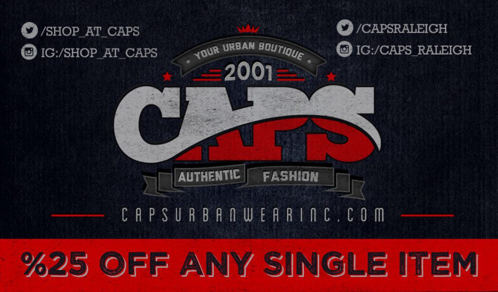
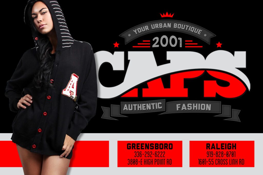
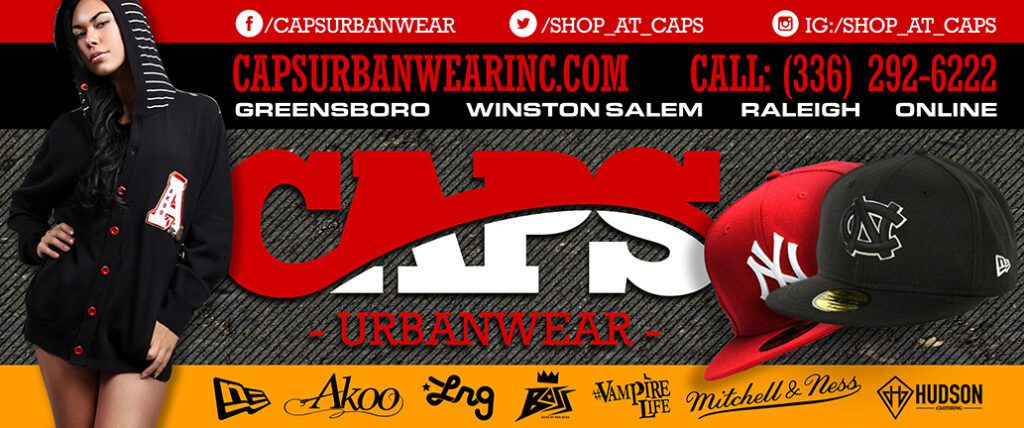
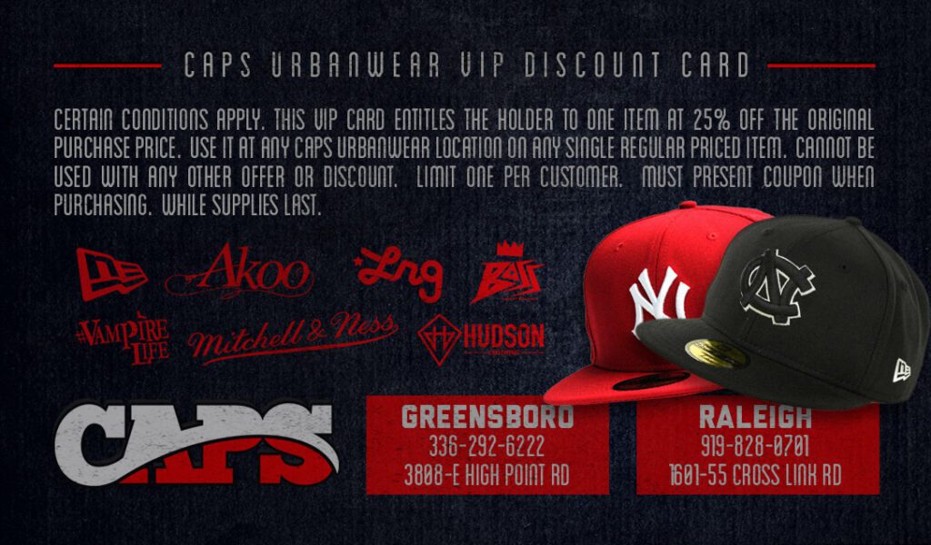
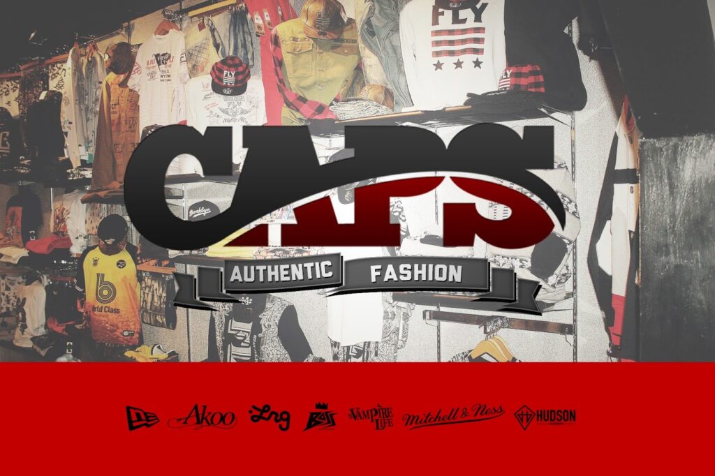
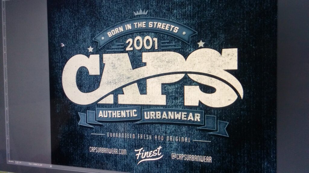
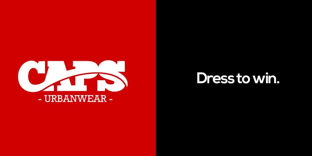
- Logo Redesign (The Iconic “C”): The second logo design (which became the definitive brand identity) is significantly more modern and impactful, perfectly capturing the “urbanwear” aesthetic. The design features a bold, chunky, slab-serif font for the word “CAPS,” conveying a sense of strength and street-style credibility. The most distinctive element is a stylized, red “cap” that sits atop and overlaps the “C,” creating a clever visual pun that directly references the company name and the idea of headwear. This “cap” element is abstract enough to feel modern and avoid a literal, dated representation. The way the cap interacts with the white space of the “C” adds dynamism and visual interest. The “APS” is cleverly integrated beneath the curve of the cap, creating a compact and unified design. The overall color palette of red and black is classic, bold, and attention-grabbing, suitable for a brand targeting a younger, fashion-forward audience. The design came together quickly, feeling like an intuitive and perfect fit for the brand’s new direction.
- Multi-Channel Implementation: The new branding was consistently applied across a wide range of materials:
- Storefront Signage: Eye-catching signage was designed and installed for both the original location and the new Raleigh store.
- Vehicle Wrap: A striking vehicle wrap was created for a van, featuring [describe the design, including the use of gold vinyl]. This served as a mobile billboard, extending the brand’s reach.
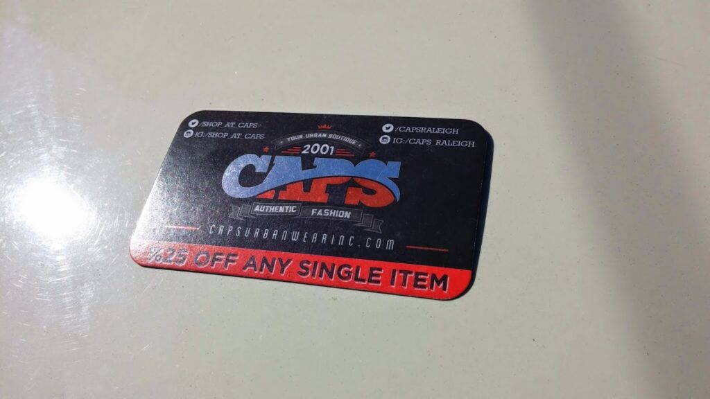
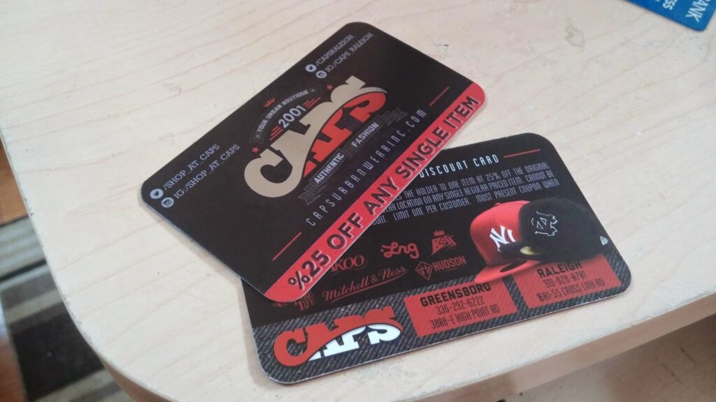
- Printed Materials: Business cards and postcards were designed to reflect the new urbanwear aesthetic.
- Large-Format Advertising: Banners and billboards were created to further amplify the brand’s message.
- Photography: I collaborated with the owner to produce high-quality images for promotional use.

Results and Reflection:
The rebranding of Cap’s Urbanwear was a significant success. The new name and logo positioned the company as a modern, trend-conscious retailer, and the consistent application of the branding across all channels created a strong and memorable brand identity. The iterative design process, with the second logo significantly improving upon the first, highlights the importance of continuous refinement and adaptation in branding. The project also demonstrates the power of collaboration, working closely with the owner, Kaleik R. Flippen, to achieve his vision for the brand. This project showcases expertise in brand strategy, logo design, visual identity, print design, signage design, and vehicle wrap design. It also shows my commitment to staying ahead of trends, as evidenced by the adoption of the “urbanwear” term before it became mainstream, and to truly understanding a client’s target market, even when it requires stepping outside of one’s personal comfort zone.

One Comment:
zoritoler imol
March 28, 2025 / at 11:21 am
Thank you for your entire labor on this web site. My daughter take interest in setting aside time for research and it’s really obvious why. We notice all of the compelling mode you create very useful things via your website and therefore boost participation from the others about this area of interest so our girl is really starting to learn a whole lot. Enjoy the remaining portion of the new year. You are performing a dazzling job.