Client: A&V Company
Greensboro/High Point, NC
Project Overview:
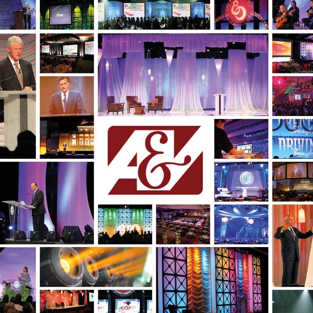
This project involved refining the existing brand identity for A&V Company, a well-established provider of professional audio-visual presentation services for corporate, association, and sporting events. With over 30 years of experience and a client list including high-profile events like the Democratic National Convention (DNC), A&V Company sought to subtly modernize its logo and reinforce its brand messaging. The project encompassed logo refinement and the application of the updated branding across various materials [Specify the materials – e.g., business cards, website mockups, presentation templates, etc.]. The company has since transitioned to become part of On Services, a nationwide provider of live event production services.
Challenge:
The challenge was to update and refine the A&V Company logo without losing the brand recognition and equity it had built over three decades. The existing logo featured highly stylized, almost illegible “A” and “V” letterforms with a heavy 3D, beveled effect, a deep red color, and a gray gradient background. This design felt dated and lacked the visual clarity needed for a modern technology company. The updated branding needed to convey professionalism, technical expertise, reliability, and a commitment to using the latest technology. It also needed to reflect the company’s “turnkey solutions” approach, providing comprehensive AV services for a wide range of events.
Solution:
The solution was a subtle yet impactful refinement of the existing A&V Company logo, combined with a consistent application of the updated branding across key materials.
Logo Refinement: Subtle Changes, Significant Impact
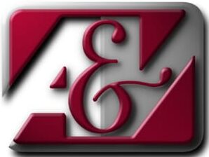
The original A&V Company logo (see Figure 1) featured highly stylized, almost illegible “A” and “V” letterforms with a heavy 3D, beveled effect, a deep red color, and a gray gradient background. This design felt dated and lacked the visual clarity needed for a modern technology company. The refined logo (see Figure 2) retained the core “A&V” concept, preserving brand recognition, but made several key improvements:
- Simplified and Modernized Letterforms: The “A&V” was completely redrawn using a clean, geometric sans-serif font. The overly stylized, 3D shapes were replaced with sharp angles and clean lines, significantly improving legibility and creating a contemporary feel.
- Eliminated 3D Effect: The dated 3D bevel and gradient were removed, resulting in a flat, modern design that is more versatile and scalable.
- Modern Color Palette: The color palette was updated to use a dark gray/black for the “A” and “V,” and a vibrant blue for the ampersand and a connecting horizontal stroke. This created a stronger visual contrast and a more sophisticated look.
- Connecting Stroke: A horizontal blue stroke was added to connect the “A” and the “V,” subtly unifying the letters and adding a visual element of connection.
- Added “Company” Text: The word “Company” was added below the logo in a simple, all-caps sans-serif font, providing clear context.
The overall goal of these refinements was to create a logo that felt more modern, polished, and visually appealing, while still being instantly recognizable to existing A&V Company clients. The subtle changes resulted in a significant improvement in the logo’s overall impact and professionalism, transforming it from a dated and somewhat clunky design to a clean, modern, and memorable brand mark.
Branding Applications:
The updated branding was consistently applied across a variety of materials, reinforcing the company’s professional image:
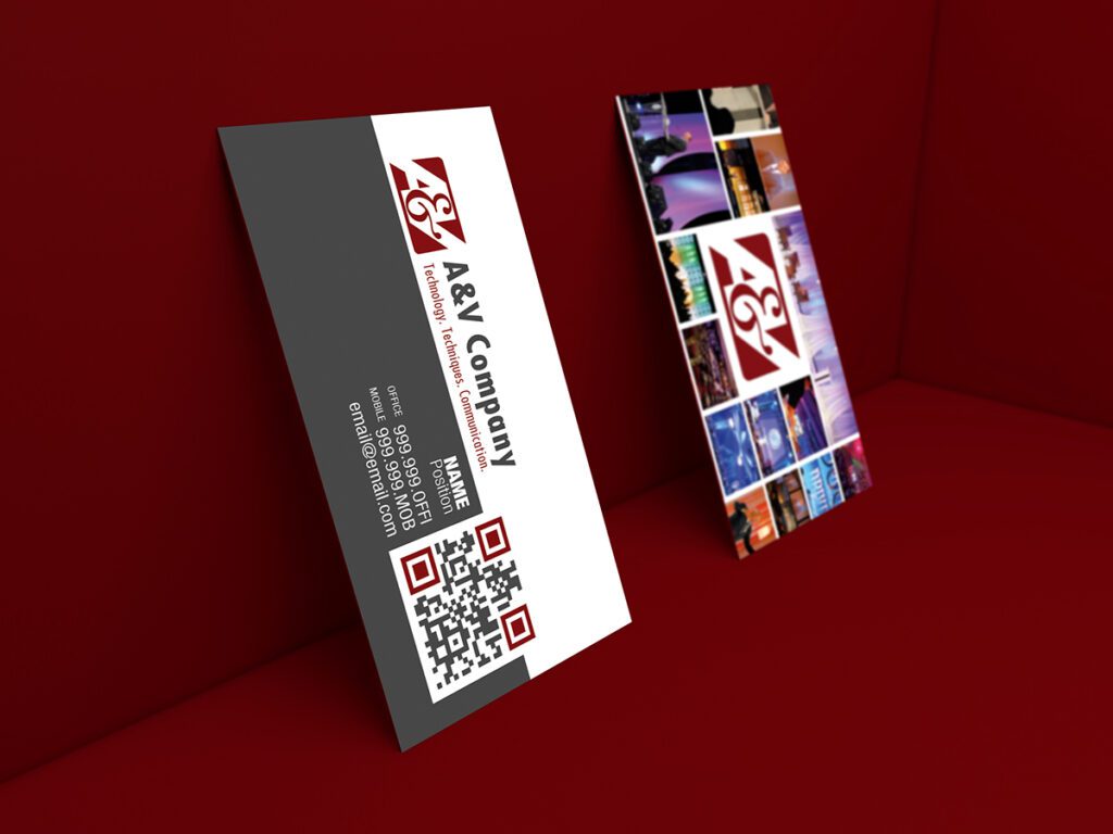
- Business Cards: New business cards were designed, featuring the refined logo prominently on a clean, white background. The design emphasized simplicity and clarity, with ample white space and a focus on essential contact information.
- Presentation Folders: Presentation folders incorporated the new logo and a subtle, textured background, creating a professional and visually appealing way to present proposals and other documents.
- Stationery: Letterhead and other stationery items were updated to maintain brand consistency across all communications.
- Website Mockups: Website Mockups were created.
Results and Reflection:
The refined logo and updated branding provided A&V Company with a more contemporary and polished image, while maintaining its established brand recognition. The project demonstrates expertise in logo design, branding, and visual communication, and the ability to subtly yet effectively modernize an existing brand identity. The subsequent transition to On Services suggests that the refined branding may have played a role in positioning A&V Company for a successful merger or acquisition.