
Client: Gatlyn’s Gourmet Popcorn
Greensboro, NC
Project Overview:
This project for Gatlyn’s Gourmet Popcorn, a small, privately owned shop in Greensboro, NC, encompassed a complete rebrand, packaging design, and the development of an innovative automated system for generating product mockups and printable labels. Named after the owner Justin’s daughter, Gatlyn’s needed a brand identity that was both kid-friendly and appealing to adults. The project focused on creating a consistent brand aesthetic, streamlining the process of introducing new flavors, and providing a cost-effective solution for a small business with limited resources.
Challenge:
Gatlyn’s Popcorn faced several challenges:
- Outdated Branding: The existing brand identity (if any) lacked a cohesive and appealing aesthetic.
- Inefficient Product Photography: Photographing each new popcorn flavor individually would be time-consuming and expensive.
- Label Creation Bottleneck: Manually designing and creating labels for each new flavor was inefficient and prone to errors.
- Nutritional Information: Accurately calculating and displaying nutritional information on the labels was a requirement.
- Limited Budget: As a small business, Gatlyn’s had limited resources for marketing and design.
Solution:
The solution combined a comprehensive rebranding effort with the development of a custom-built automated system for product mockup and label generation.
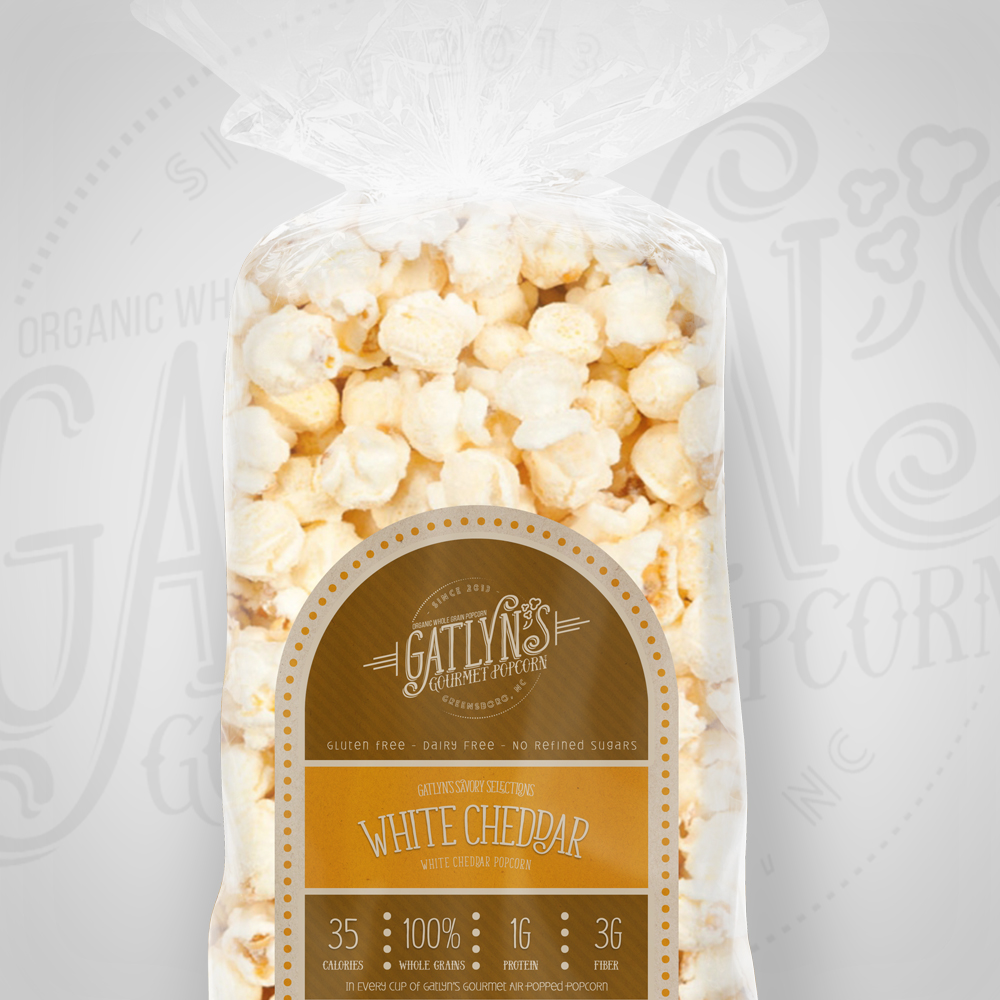
Branding: A “Kiddy, Cute, Serious But Not So Serious” Aesthetic
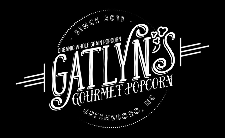
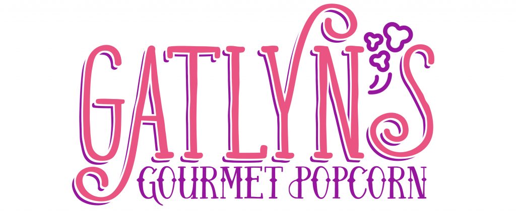
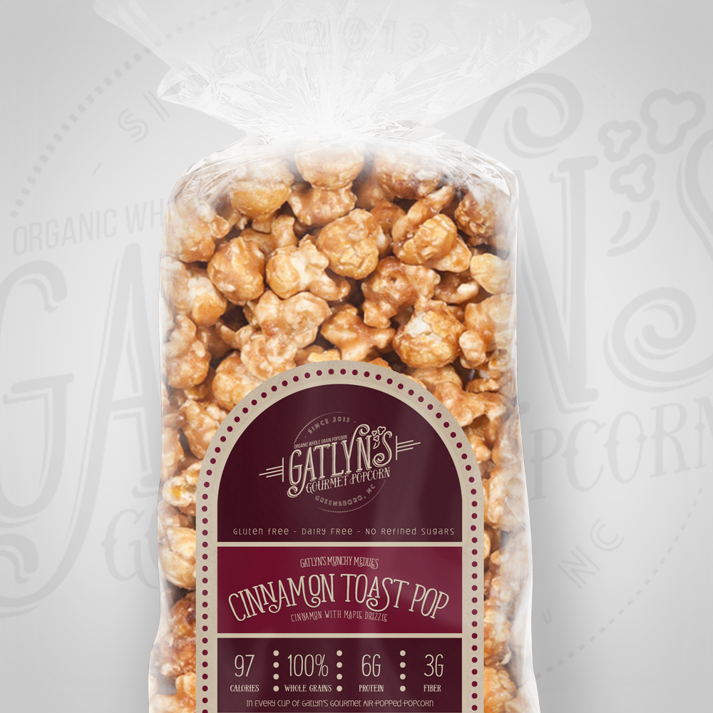
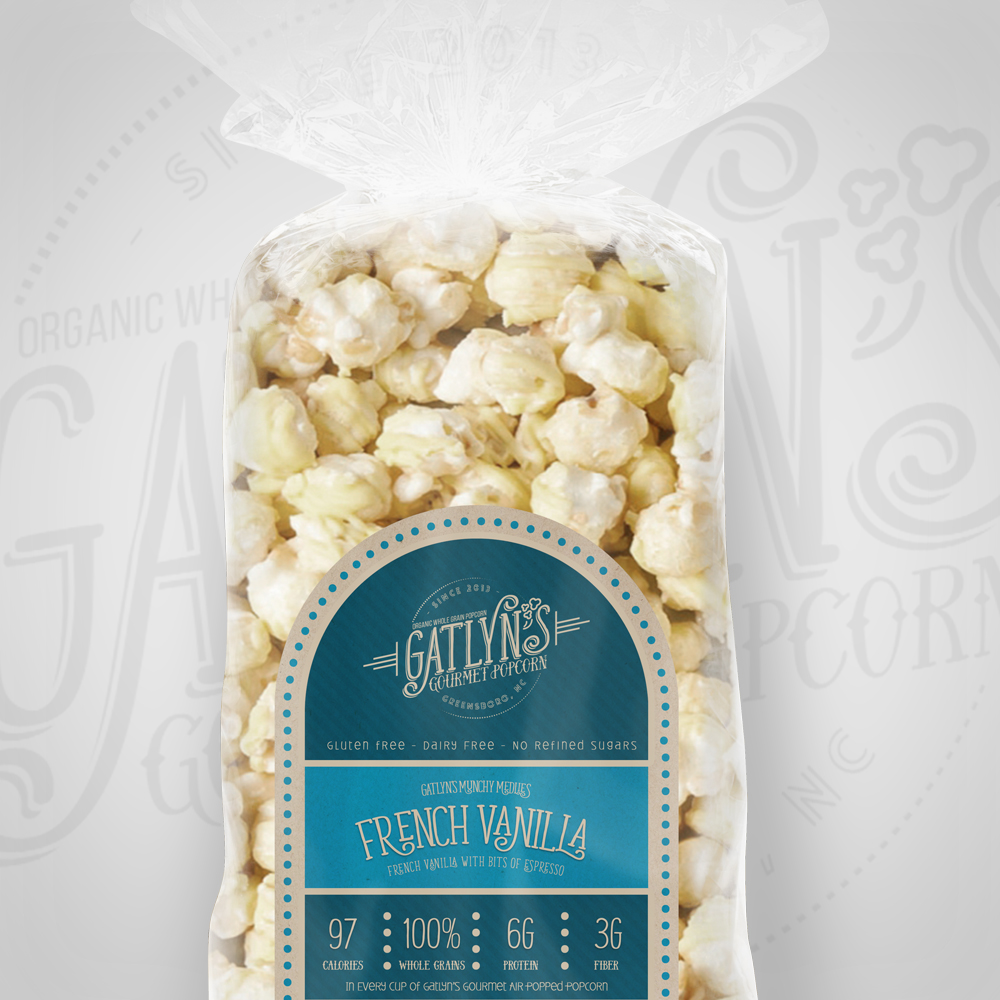
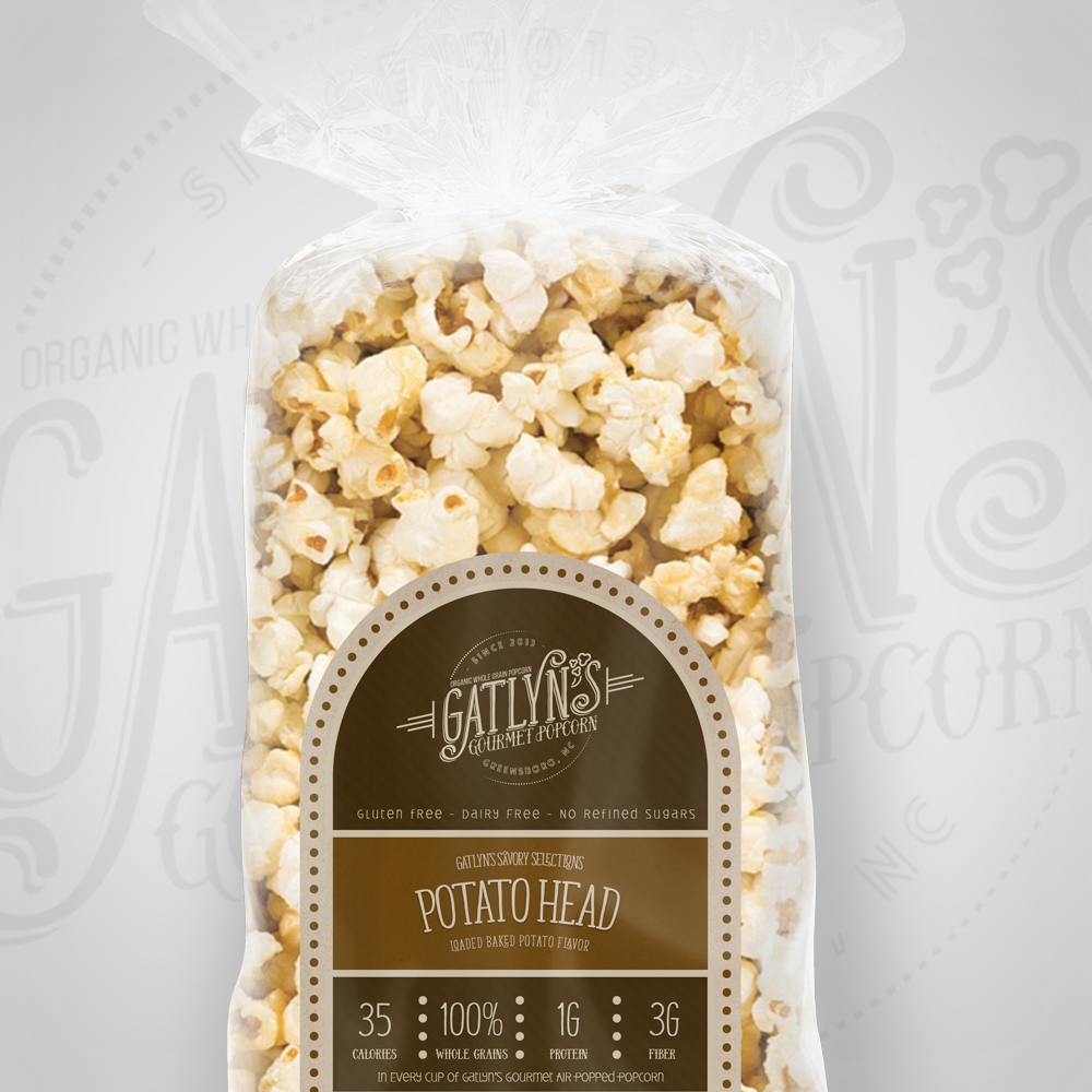
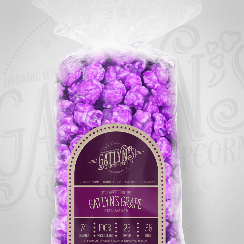
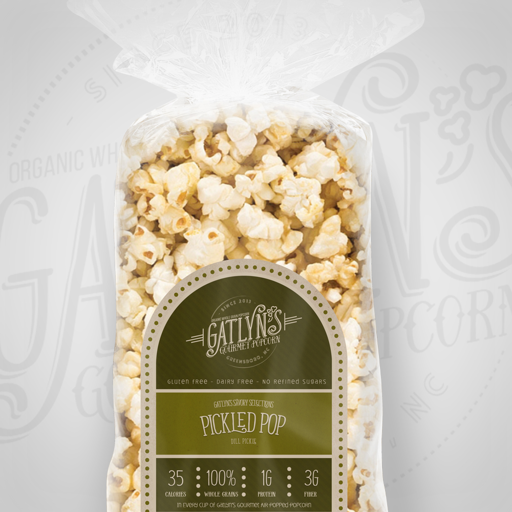
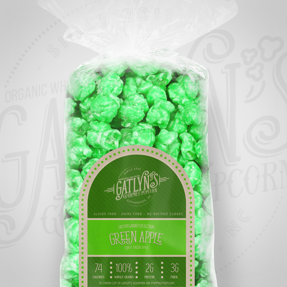
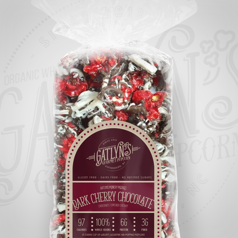
The first step was to create a new brand identity that reflected the unique personality of Gatlyn’s Popcorn. The main logo was designed to be a blend of kid-friendly and mature, aiming for an “earthy, Godiva Style” or “Panera bread look.” [Describe the main logo – shape, typography, colors, and the intended feeling]. A secondary, vintage badge-style logo was created specifically for use on the product labels, incorporating the term “whole grain.”
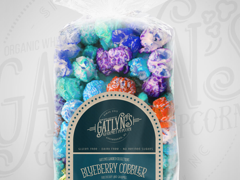
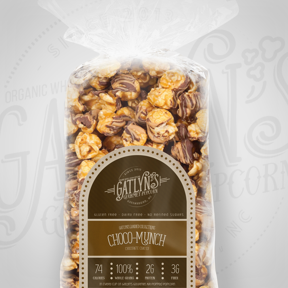
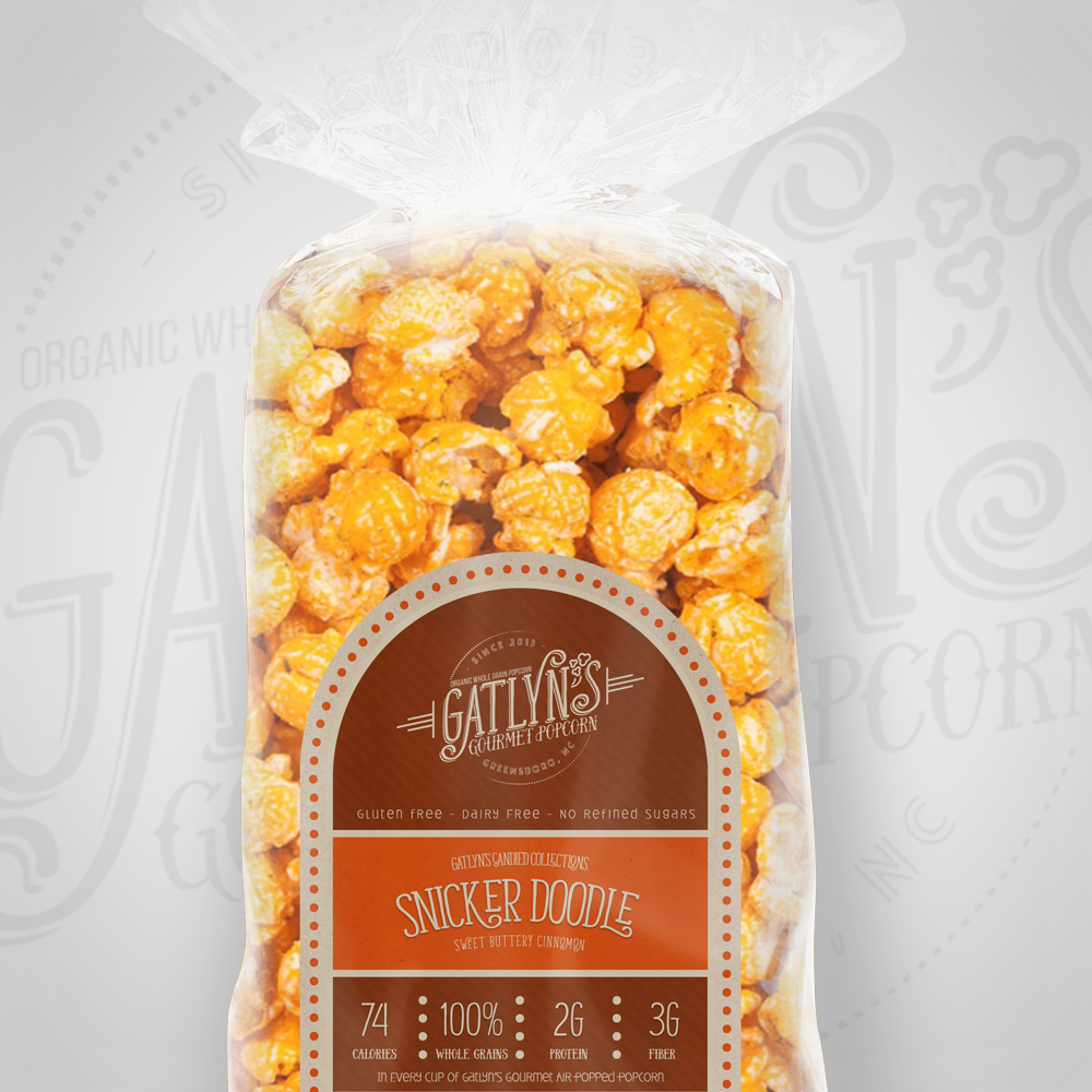
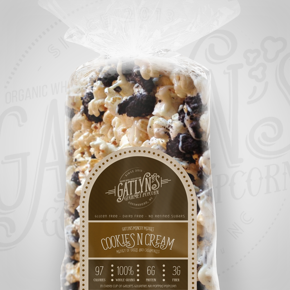
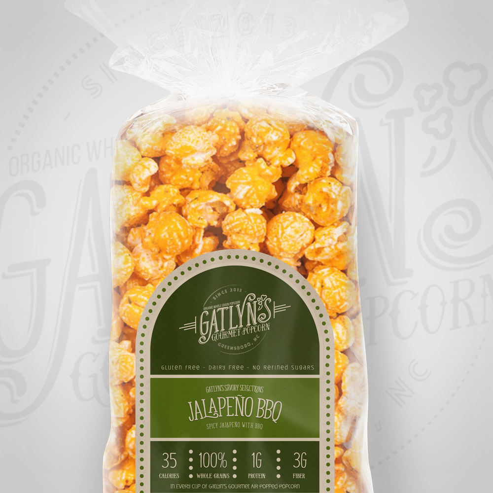
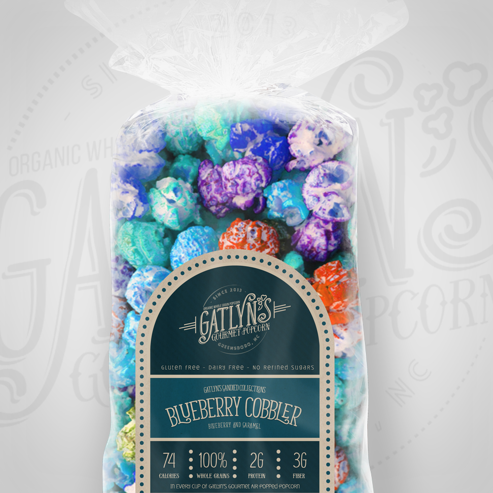
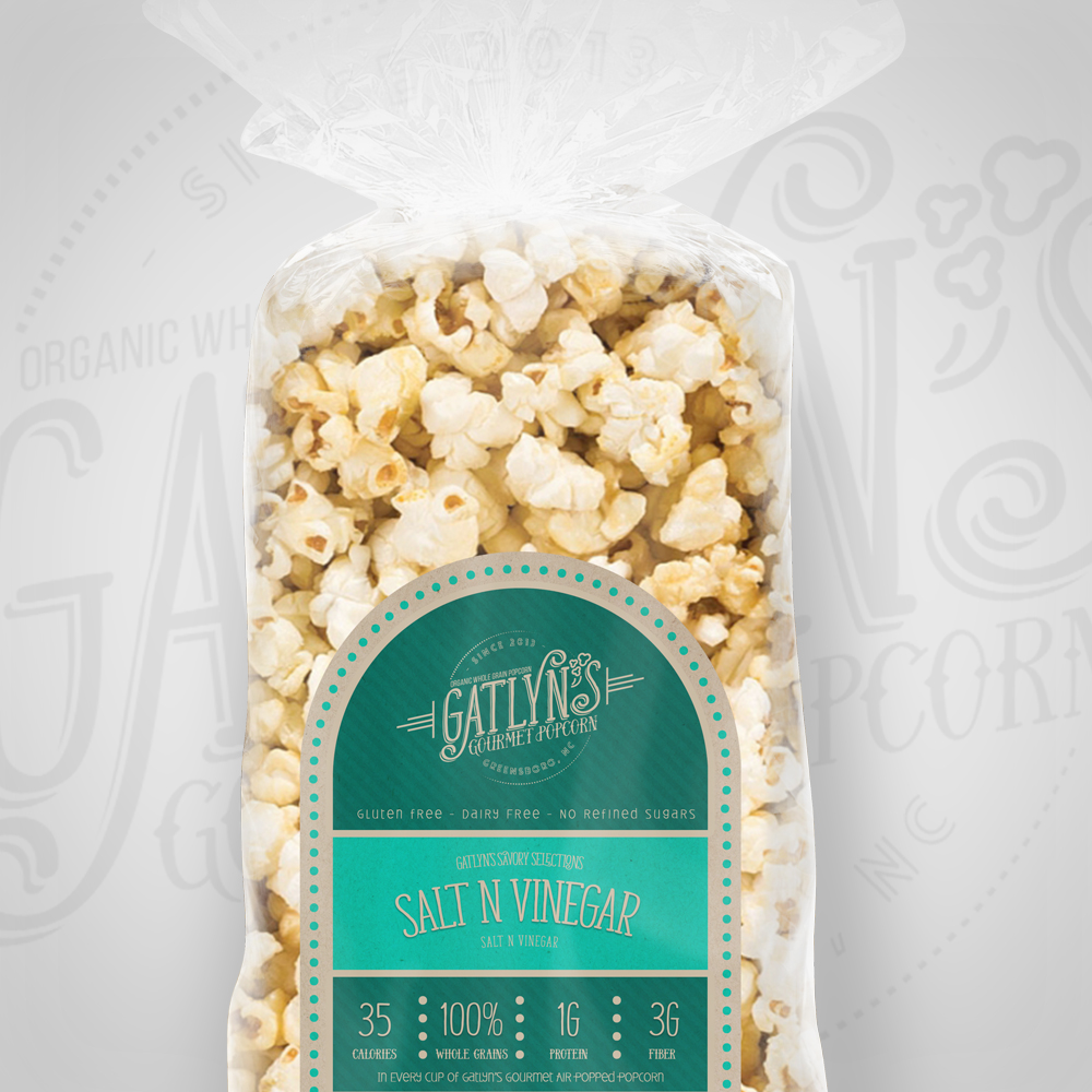
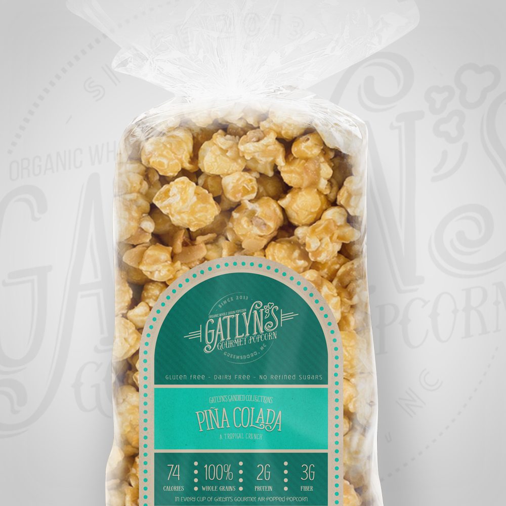
Packaging Design: Kraft Paper and Cellophane
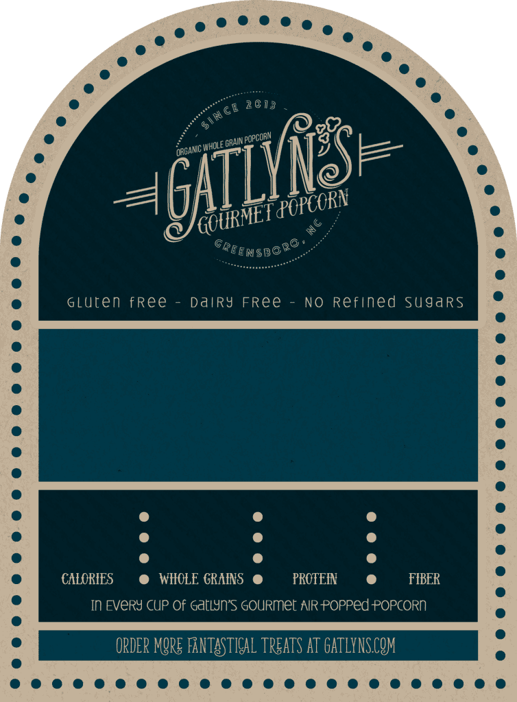
The packaging design focused on simplicity and cost-effectiveness. Pint-size cellophane food bags were chosen, providing a clear view of the product. Kraft paper labels from OnlineLabels.com were selected for their natural, earthy look and their compatibility with on-demand printing. The labels were designed with a dedicated space for the flavor name, a section for nutritional information, and a consistent overall layout, available in approximately 50 different colors to provide visual variety.
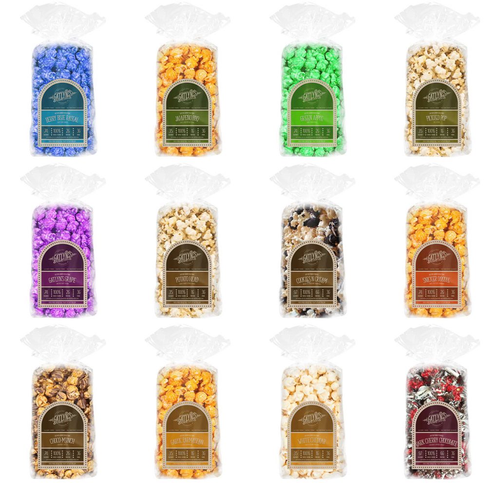
The Automated Mockup and Label System: Streamlining New Product Creation
The core of the project was the development of an automated system to generate product mockups and printable labels. This system dramatically reduced the time and cost associated with introducing new popcorn flavors.
The system worked as follows:
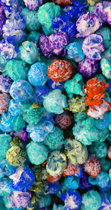
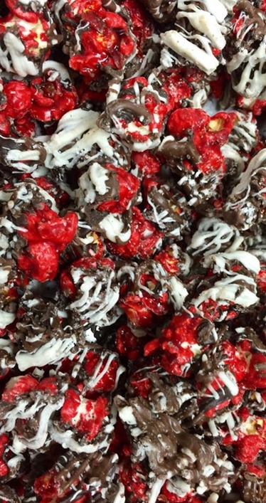
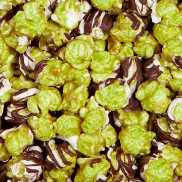
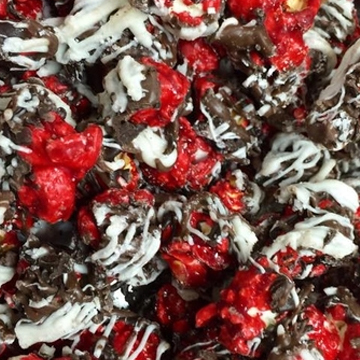
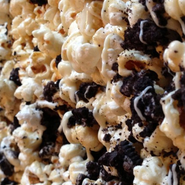
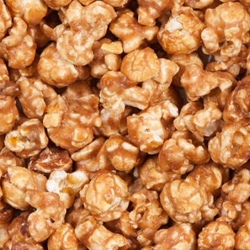
- Popcorn Photography: Initial photos of various popcorn flavors were taken (initially using an iPhone, with the understanding that higher-quality photos would be ideal).
- Photoshop Processing: The photos were cropped into squares, and a custom Photoshop action was created to mirror and blend the images, creating a consistent, vertically-oriented “bag” shape.
- Data Management (Excel): An Excel spreadsheet was used to store all relevant product information for each flavor, including:
- Flavor Name
- Highlight Ingredients
- Nutritional Information (Calories, Protein, Fiber, etc.)
- Label Color
- Path to the Processed Popcorn Image
- Path to the colored label.
- Label Templates: Label templates were created in Photoshop, with text fields corresponding to the data in the Excel spreadsheet.
- Photoshop Variable Data: Photoshop’s variable data feature was used to link the text fields in the label templates to the corresponding columns in the Excel spreadsheet. This allowed for the automatic generation of unique labels for each flavor, populated with the correct information.
- Automated Mockup Creation: Using a cellophane bread bag mockup from GraphicRiver as a base, the processed popcorn images would be placed as a layer under the bag mockup.
- Output: The system generated both print-ready label files (for printing on the kraft paper labels) and product mockup images (for use on the website or in marketing materials).
This system reduced the time required to create a new flavor visual (mockup and label) to approximately 2 minutes (excluding the time to actually make the popcorn), a significant improvement over manual design and photography.


Nutritional Label Calculation:
The system also incorporated a method for calculating the nutritional information for each flavor, based on the ingredients entered into the Excel spreadsheet.
Website Integration (Planned):
Although not fully implemented during the project, the long-term vision was to integrate the mockup and label generation system directly into the Gatlyn’s Popcorn website.
Results and Reflection:
The Gatlyn’s Popcorn project successfully delivered a new brand identity, packaging design, and, most importantly, a highly efficient system for creating product visuals and labels. This system significantly reduced the time and cost associated with introducing new flavors, empowering the small business to expand its product offerings quickly and easily. While a professional photoshoot would have been ideal, the automated mockup system provided a practical and cost-effective solution that met the client’s immediate needs. The project demonstrates expertise in branding, packaging design, workflow automation, and leveraging Photoshop’s variable data capabilities. It also highlights the importance of understanding a client’s specific constraints and developing creative solutions tailored to their budget and resources.
Technology
- Photoshop
- Photoshop Actions
- Excel
- Variable Data
- Kraft Paper Labels
- OnlineLabels.com


One Comment:
zoritoler imol
March 27, 2025 / at 4:18 pm
Your style is so unique compared to many other people. Thank you for publishing when you have the opportunity,Guess I will just make this bookmarked.2