Project Overview:
This project involved developing the core brand identity and packaging for Solarogen, a line of colorants and water conditioners for ponds, lakes, and water features, produced by Standard Colors, a global leader in pigment and dye manufacturing. The work encompassed logo design, packaging design, and tagline creation, establishing a cohesive and visually appealing brand identity that emphasized the products’ effectiveness and safe, non-toxic formulation.
Challenge:
The challenge was to create a brand identity for Solarogen that would:
- Communicate Effectiveness and Safety: Clearly convey that the products were both effective in coloring and conditioning water and safe for fish, plants, and wildlife.
- Differentiate from Competitors: Stand out in a market often dominated by synthetic or chemical-sounding products, emphasizing the natural aspect where appropriate.
- Unify Diverse Products: Create a cohesive brand identity across a range of different product types (pond dyes in various forms, a water clarifier, and copper sulfate crystals) with varying applications.
- Leverage Parent Company Expertise: Subtly connect to Standard Colors’ established reputation as a color expert, without overshadowing the Solarogen brand.
Solution:
The solution was a comprehensive branding and packaging design that emphasized vibrant color, natural beauty, ease of use, and the backing of Standard Colors’ expertise.
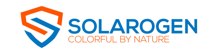
Logo Design:
The Solarogen logo features a modern, clean, and visually striking design that effectively communicates the brand’s core values. The logo features the word “SOLAROGEN” in a bold, slightly rounded sans-serif font. The letters are a vibrant, medium-blue color, suggesting water and sky. The tagline, “COLORFUL BY NATURE,” appears directly beneath the company name in a thinner, all-caps sans-serif font, rendered in a bright orange color that provides a strong visual contrast.
To the left of the text, a distinctive graphic element is incorporated. This element resembles an abstract “S” shape, formed by two interlocking, angular shapes. One shape is a bright orange, matching the tagline text; the other is the same blue as the “SOLAROGEN” text. This “S” shape can be interpreted in multiple ways: as a stylized sun, as a wave of water, or even as an abstract representation of the chemical processes involved in creating color. This ambiguity adds to the logo’s intrigue and memorability. The overall effect is a logo that is both modern and approachable, conveying a sense of both scientific expertise and natural beauty.
Taglines:
Two taglines were developed to capture the essence of the Solarogen brand:
- “Colorful by Nature”: This tagline, prominently featured on marketing materials and the logo, emphasizes the vibrant colors achievable with the products and hints at their environmentally conscious formulation.
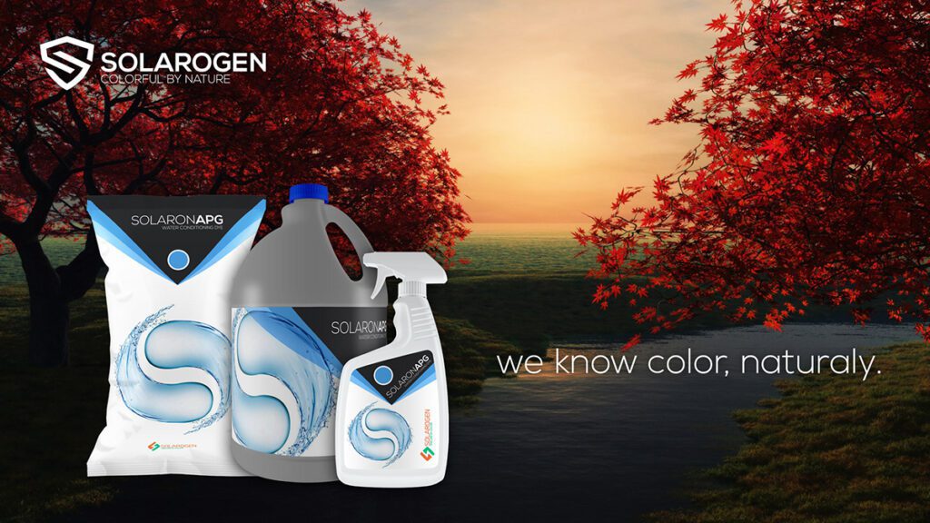
- “And We Know Color, Naturally”: This tagline subtly leverages Standard Colors’ expertise in the color industry while reinforcing the natural positioning of the Solarogen line.
Packaging Design:
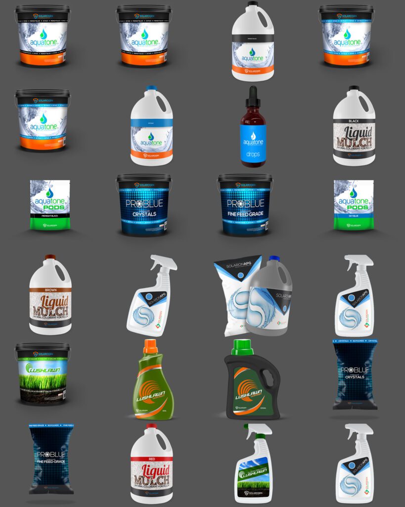
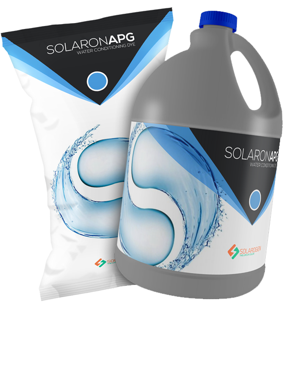
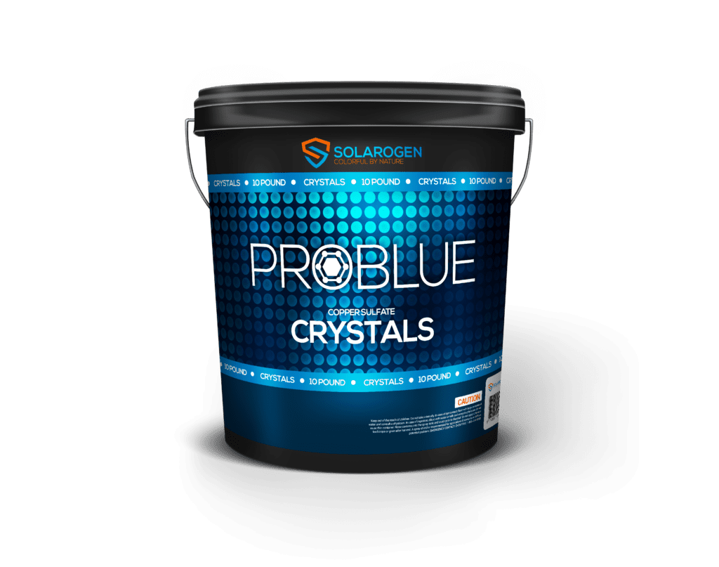
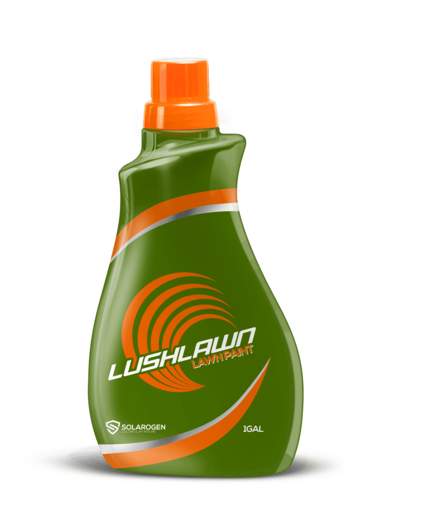
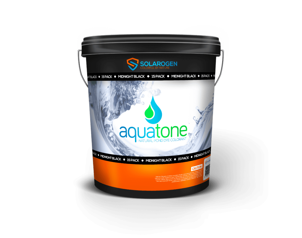
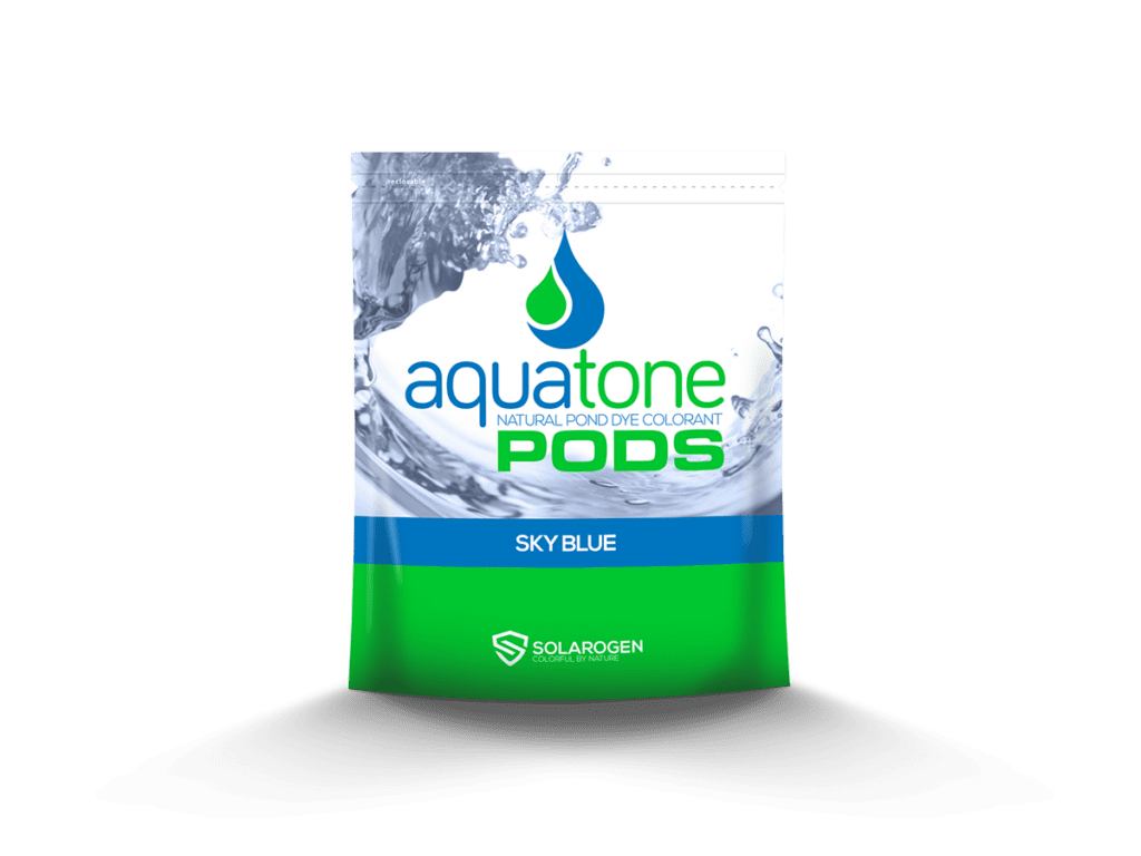
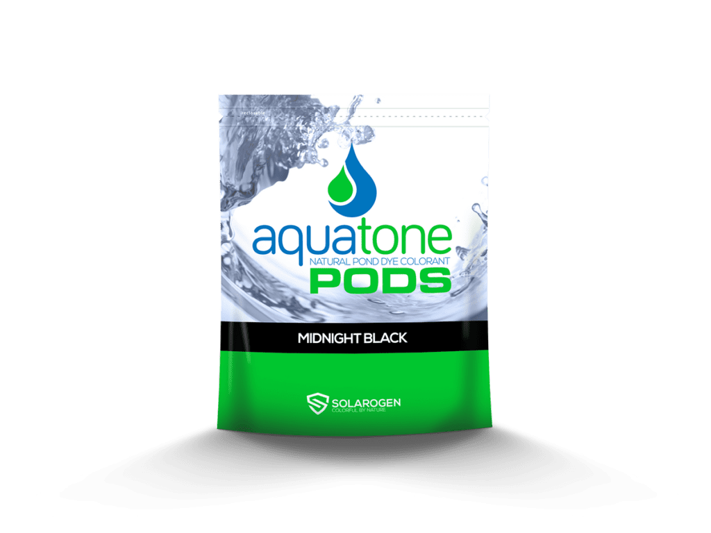
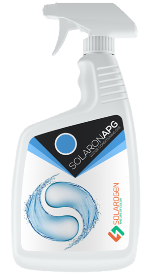
The packaging for the Solarogen line utilizes a clean and modern design, with a white background and prominent use of the Solarogen logo and product name. The different product types are differentiated by color accents and clear product descriptions. The AquaTone Pond Pods are packaged in both resealable foil pouches and plastic buckets, catering to different user needs. The liquid dyes are packaged in plastic jugs, while the ProBlue Copper Sulfate Crystals are likely packaged in a sturdy container suitable for a chemical product. The overall packaging design conveys a sense of professionalism, effectiveness, and environmental responsibility, aligning with the brand’s positioning.
Results and Reflection:
The Solarogen project successfully established a cohesive and visually appealing brand identity for a diverse line of water colorants and conditioners. The logo, packaging design, and taglines effectively communicate the brand’s core message of vibrant color, effectiveness, and safety. The project demonstrates expertise in logo design, packaging design, and tagline development. The project also highlights the importance of clear and consistent messaging, particularly when dealing with a product line that includes both aesthetic and functional elements. The connection to Standard Colors, a respected name in the color industry, adds credibility and reinforces the brand’s promise of quality.