Client: SANS Fibers (a division of AECI)
Stoneville, NC
Project Overview:
This project focused on developing a refined brand identity for SANS Fibers, a (now defunct) division of AECI and a leading US manufacturer of high-tenacity nylon and polyester yarns. The scope included a subtle logo redesign and the comprehensive planning and outlining of a new website (though not the actual development). The goal was to modernize the brand image, communicate the company’s core values (strength, reliability, experience), and clearly articulate its unique selling propositions to a B2B audience of textile and industrial manufacturers.
Challenge:
SANS Fibers, a well-established company with a global reach, needed to update its brand identity to better reflect its innovative products and modern approach. The challenge was to create a subtle rebrand – a refresh, not a radical overhaul. The new logo and branding needed to feel contemporary and visually appealing, while still maintaining a sense of professionalism and trust appropriate for a B2B company in the industrial sector. The existing branding felt dated, with a traditional serif font and a less dynamic logo.
Solution:
The solution was a refined and modernized brand identity, centered around a new logo and a comprehensive plan for a redesigned website.
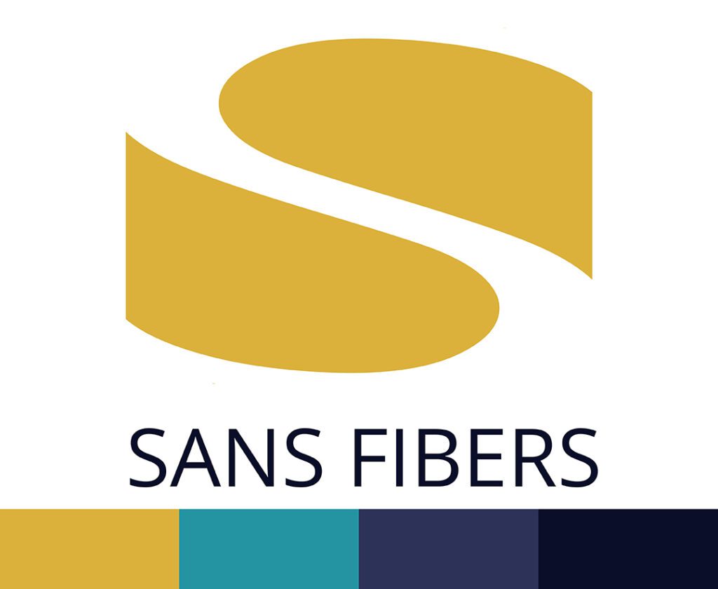
Logo Design: The Flowing “S”
The new SANS Fibers logo features a dynamic, abstract “S” symbol as its core element. This “S” is formed by two interlocking, curved shapes, rendered in a warm, golden-yellow color. The flowing lines of the symbol subtly suggest the movement and flexibility of fibers, while the golden-yellow hue hints at quality and innovation. The company name, “SANS FIBERS,” is presented below the symbol in a clean, modern, all-caps sans-serif font, providing a strong and stable foundation. The overall effect is a logo that is both contemporary and timeless, conveying a sense of sophistication and industry leadership.


Website Planning and Outline:
While full website development was not part of the project scope, I created a comprehensive plan and outline for its structure, content, and functionality. This plan was designed to provide a clear and informative online experience for potential customers, primarily textile and industrial manufacturers. The planned website would serve as a central hub for information about SANS Fibers’ products, capabilities, and company values.
The homepage was envisioned to immediately communicate SANS Fibers’ core message and value proposition, likely featuring high-quality imagery of their products in use and a prominent call to action. A dedicated “Why SANS Fibers” section would articulate the company’s unique selling propositions, emphasizing their two-stage manufacturing process, over 30 years of experience, commitment to quality, and US-based production. The proposed tagline, “Strength in Stitch,” would be prominently featured, encapsulating the brand’s core message.
To make the technical aspects of yarn manufacturing more accessible, a dedicated section explaining the process (Spinning, Extruding, Quenching, Winding/Twisting, Draw wind/Draw twist) was planned, potentially incorporating illustrative icons and concise descriptions for each step.
Separate product pages for High Tenacity Nylon and High Tenacity Polyester would provide detailed product information, including clear descriptions of use cases and links to downloadable technical data sheets (presented in a user-friendly format, not just raw specifications).
The website would also include a Careers section to attract potential employees, highlighting company culture and benefits. An “About Us” section would provide information about SANS Fibers’ history, its relationship with AECI, its commitment to sustainability, and its team, emphasizing the expertise of the line workers. A Contact/Support section would offer clear contact information for various departments, and a “Start Your Project” page would feature a streamlined contact form to encourage inquiries. Finally, a dedicated section would showcase SANS Fibers’ ISO certifications, reinforcing their commitment to quality. [Include any wireframes]
Results and Reflection:
The redesigned logo and website plan provided SANS Fibers with a modernized brand identity and a clear roadmap for a more effective online presence. The project demonstrates expertise in branding, logo design, website planning, and content strategy for a B2B audience in the industrial manufacturing sector. The “Strength in Stitch” tagline encapsulated the core value proposition of SANS Fibers, highlighting both the quality of their products and the dedication of their team. The project also involved extensive research into the competitive landscape, target customer needs, and the technical aspects of yarn manufacturing.